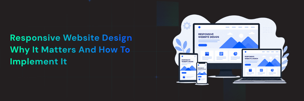
Responsive Website Design: Why It Matters and How to Implement It
- Miss. Lily
- 2 min read
Working with the Right Team
Introduction
In the current high-paced online environment, customers demand smooth-sailing browsing experiences on all devices, be they on a smartphone, tablet, or desktop. This behavioral change has resulted in responsive web design being a necessity as opposed to an indulgence. Companies that cannot adapt to change may lose their visibility as well as credibility in a growing competitive web world.
An organized and mobile-friendly webpage is not only easier to use but also enhances brand awareness, boosts interaction, and leads to conversions. As search engines now focus on mobile usability, the need to develop responsive websites is no longer a choice but a necessity for sustainable growth.
What is Responsive Website Design?
A Flexible Design Approach
Responsive web design is a web development strategy in which a website is designed to automatically respond to the size and the device with which it is viewed by the user. A single responsive web design site is used instead of designing two websites, one mobile and one desktop, so that it can be used on all platforms.
It is fluid grids, scalable images, and flexible layouts, which enable this flexibility. Consequently, companies are in a position to have a single digital presence and provide the best performance to users, irrespective of their access method to the site.
Mobile-First Mindset
Modern responsive web development is based on a mobile-first approach. This approach entails the creation of the website with small screens as the main consideration and then scaling to the bigger ones.
Mobile traffic has overtaken desktop traffic in the world, and therefore, emphasis should be on responsive web design on mobile devices to guarantee users a seamless, user-friendly experience at the very beginning. It also fits into the algorithms of search engines, which prioritize mobile-friendly web pages in search results.
Why Responsive Design Matters for Businesses
Enhanced User Experience
The user experience is essential in keeping your visitors on your site or abandoning it in a few seconds. Mobile-responsive web design can guarantee that the navigation is easy, information is readable, and interactions are easy on all the devices.
The ease with which users can navigate, scroll, and interact without frustration increases the chances of them becoming customers. Companies that invest in the most appropriate responsive web design have increased levels of engagement, reduced bounce rates, and enhanced customer satisfaction.
SEO Benefits
Google and other search engines give preference to websites that are friendly to mobile devices. An effective responsive web design improves the speed of loading a webpage, usability, and making content available on any device, and all these are essential ranking factors.
By engaging responsive website design services, the businesses will be in a position to optimize their websites for the search engines without having to keep different versions. This combined style enhances the efficiency of indexing and increases the organic visibility, which leads to more traffic.
Cost-Effective Maintenance
Having different sites for desktop and mobile may be expensive and time-consuming. One responsive web design site saves on the development and maintenance costs and provides uniformity in branding and functionality.
Working with a responsive web design agency enables the businesses to simplify the work of updating, minimize technical problems, and save money in the long term. This effectiveness renders responsive design a clever expenditure on companies aiming to grow sustainably.
Key Elements of a Responsive Website
There are a number of important elements that must be in harmony in order to create a successful responsive site. Fluid grid systems make sure that the layout scales with screen size, whereas flexible images will not be distorted and will not deteriorate the visual quality.
Typography is also a crucial element. The text should not be so small that one will have to zoom to see. Smaller screens should be made easier to navigate, with collapsible menus frequently being employed to improve the usability.
It is also important to optimize performance. The need to have fast loading speeds is critical in retaining the users, especially on the mobile networks. The lightweight design aspects and the practice of efficient coding are the main factors that are taken into consideration in many of the best responsive design websites in order to provide smooth performance.
All these factors come together to produce an integrated and easy-to-use experience that is easily compatible with any device.
How to Implement Responsive Web Design
Responsive design must be implemented in a strategic approach involving design, development, and testing. Companies usually count on the services of a top responsive web design firm to do the work professionally and deliver the best results.
It starts with planning and wireframing, in which designers visually map out the way the site will be responsive to various screen sizes. This is then succeeded by development, whereby responsive frameworks and coding techniques are employed to create flexible layouts.
An important stage is testing. A site has to be tested on various devices and browsers to be able to perform consistently. Ongoing optimization means that the site will be efficient as new devices and technologies come up.
By seeking services of responsive website design, it is possible to get the services of experienced developers who are aware of the intricacies of cross-device compatibility. This knowledge guarantees the end product not just to be aesthetically appealing but also to be strong in terms of technology.
Also, companies enjoy continuous maintenance and updates, which keep their site abreast of the changing user demands and search engine standards.
Common Mistakes to Avoid in Responsive Design
Although it is important, numerous companies make preventable errors in applying responsive design. Among them is the failure to consider mobile users in the design stage. In the absence of mobile-first design, a website tends to look crammed and hard to use on smaller screens.
The other error is to overload the site with heavy pictures and other unnecessary items. This has the potential to greatly drag down loading speeds and hurt user experience and SEO performance.
Confusion can also be caused by inconsistent design elements. Inconsistency in the devices compromises brand recognition and trust. Companies that want to achieve the optimum responsive web design should be consistent in the layout, colors, and functionality.
Lastly, a lack of testing may cause unforeseen problems. A site that functions well in one gadget might not on another unless it’s well tested. Collaborating with a trusted responsive site design firm will reduce the risks by performing extensive quality check-ups and professional implementation.

Conclusion
Responsive design is not a fad anymore: it is a prerequisite of contemporary companies. A responsive design of a website should be done to make sure that users have a smooth experience on all devices, and this will increase engagement, improve the search engine ranking, and increase conversion.
Through professional responsive website development, businesses can future-proof their presence in the digital world and stay competitive in the constantly changing market. Regardless of whether it is a move taken in-house or by partnering with the best responsive web design firm, responsive design is a strategic step that can bring about long-term benefit.
Finally, a responsive site is not merely a technical fix but a potent instrument that boosts user experience, builds brand reputation, and promotes long-term business development.
Frequently Asked Questions
Q1. How to implement responsive web design?
Responsive web design is implemented using flexible grids, CSS media queries, fluid images, and mobile-first layouts to adapt across all screen sizes.
Q2. What is one advantage of using a responsive design?
One major advantage of responsive design is improved user experience, as the website automatically adjusts to any device or screen resolution.
Q3. What if a website is designed with responsive design?
If a website uses responsive design, it loads correctly on all devices, reduces bounce rate, and improves search engine visibility.
Q4. Why is responsive web design important in today’s mobile-first world?
Responsive web design is important because most users browse on mobile devices, and search engines prioritize mobile-friendly websites for rankings.
Q5. Which of the following is a benefit of responsive web design?
A key benefit of responsive web design is better SEO performance, faster loading times, and consistent branding across all digital devices.
Search
Recent Post
- Responsive Website Design: Why It Matters and How to Implement It
- How E-commerce Consultants Help Grow Online Businesses in the USA
- Why App Maintenance Matters and How Often to Update Your App
- 5 Key Points to Review Before Building a Mobile App in the UK Market
- Learn to Build Eco-Friendly Websites with Sustainable Web Design
- The Impact of AI in Mobile App Development on Modern Apps
Categories
- Digital marketing (11)
- E-Commerce Development (11)
- Mobile App Development (40)
- software development (4)
- UI/UX Design (5)
- Website Development (18)
Tags
Android App Development
Android App Development Services
Angular vs React
app development
AppDevelopment
app development company in India
App Store Optimization
best app development companies
Custom App Development
Custom App Development Company
Custom mobile app development
Custom Mobile App Development Services
Custom web applications
digiauxilio
Digital Auxilio
Digital Marketing Company
Digital marketing services
Ecommerce Development
ECommerce website development
flutter app development
Hire Android App Developers
ios app development
iOS app development company
iOS app development services
mobile app
Mobile App Development
mobile app development company
mobile app development company in India
mobile app development services
mobile application development
Mobile Applications
seo
seo company
SEO executives
SEO experts
seo services
Shopify Development
Social Media Marketing
UI/UX Design
web apps designed
Web Designing Services
Web development
Website Designs
Website Development
WordPress eCommerce Development
You may also like
Responsive Website Design: Why It Matters and How to Implement It Working with the Right Team Introduction In the current...


How E-commerce Consultants Help Grow Online Businesses in the USA Working with the Right Team Introduction The current world of...

Why App Maintenance Matters and How Often to Update Your App Working with the Right Team Introduction In the contemporary...